Sarah Griffin’s 2024 Throwback Jersey Rankings
By Sarah Griffin | Jul 17, 2024
If you’re a uniform junkie with nostalgia for the days of bright colorways and mesh, there’s no better time of year than the PLL’s Throwback Weekend.
This year, each jersey pays tribute to the team’s city or state’s sports history in an individual, unique way. As a history junkie, lacrosse lover and, most importantly, fashion fanatic when it comes to sports uniforms, this year’s throwback jerseys are a treat, to say the least.
8. Carolina Chaos
For all the history buffs out there, Carolina’s jersey is for you. The “STATE” across the front of the chest is a tribute to the NC State lacrosse team, which played 10 seasons in Division I before being disbanded in 1982. The Carolinas have quite a unique lacrosse history, both collegiately and in the pros, so it’ll be very cool to see the Chaos players representing that.
I’m arguably the Chaos’s No. 1 fan when it comes to their uniforms. While I love the nod to NC State’s history, Chaos is such a unique brand on its own. I would’ve loved to see more of that in this jersey. Also, when I think Chaos, my first thoughts are red and black — I would’ve loved to see one of those two as the base color instead.
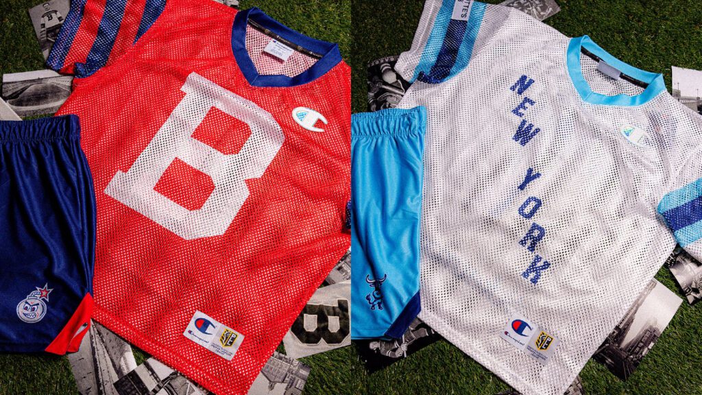
7. New York Atlas
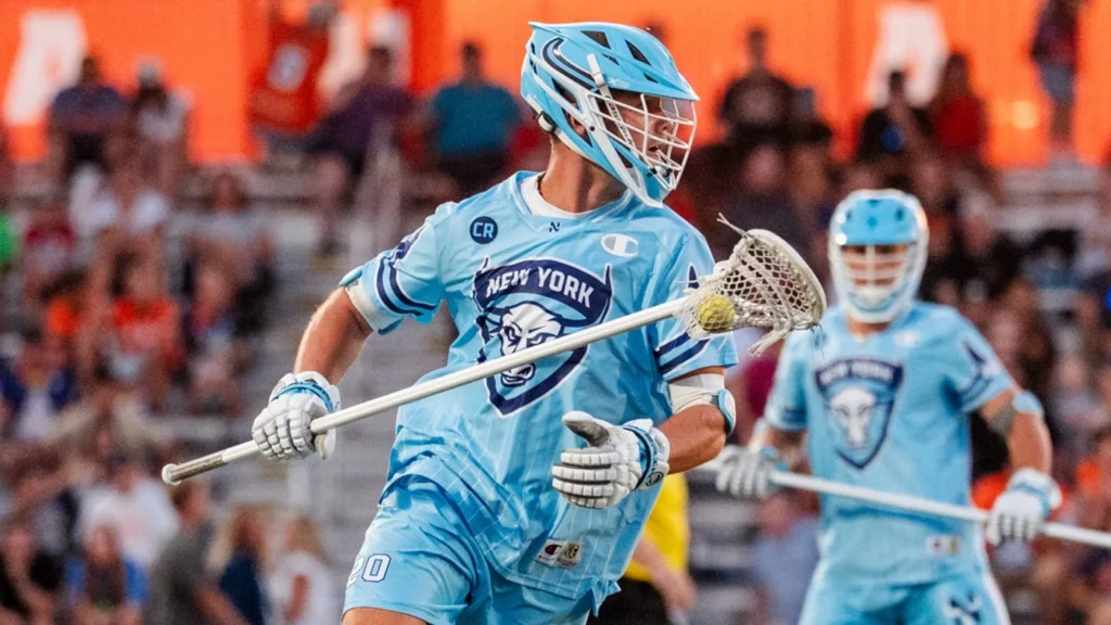
Usually, any Atlas jersey is a guaranteed top three for me because of how much I adore the aqua blue. I still do love their colorway, and make no mistake, I’m still obsessed with it, but I was really hoping for another aqua blue mesh base — especially since New York will be playing Boston in its red throwbacks!
My other grievance is I was hoping for more on the front. I obviously understand the reason for the “NEW YORK” diagonally across the front, but it just could’ve been a little more exciting, even with maybe a different font.
That sounded like a lot of negativity, but I really do like these! My favorite part is, naturally, the aqua blue collar. It’s a really cool touch.
6. Utah Archers
This is where the rankings get difficult. Which seems crazy to say, because we’re only on No. 6.
I love the stripes on the sleeves of the Archers’ throwbacks. But six other teams also have stripes on their sleeves, and there are five that I like better.
The Archers have one of the most distinctive colorways in sports, and I wish that was incorporated more loudly. Utah’s orange or navy as the base here would be fantastic, especially with the mesh. But maybe I’m just spoiled reminiscing on last year’s navy mesh with orange outlines.
While I love the giant "U" on the front, I wish it didn’t say "Utah" in the U. Nitpicky, I know. But I think the U alone would’ve been all this jersey needs.
Regardless, my favorite part of this uniform is without a doubt the Archers' cartoon logo on the shorts. I haven’t seen them incorporate this logo before and frankly, I’m obsessed with it.
5. Denver Outlaws
It was a close call for me between the Archers and Outlaws at five, but Denver’s font choice pushes it over the edge.
The western font is perfect for the Outlaws. Their colorway is what I expected, but I wouldn’t have hated a blacked-out mesh jersey, as well. But especially with the Outlaws’ history and the fact we’ve already seen them wear black quite a few times this season, this feels right for Throwback Weekend.
4. Maryland Whipsnakes
Whipsnakes fans have thought in the past that I have a vendetta against their team and their uniforms because I usually rank them on the lower end of the totem pole. Well, Whipsnakes fans, you can no longer argue that.
Speaking as a Boston Bruins fan, it pains me to say I rarely like gold on jerseys — it has to be done the right way. These do exactly that. I know gold is within the Maryland Terrapins’ color scheme, but you never see it as the standout base like it is here. I didn’t think I’d like it, but I do!
Additionally, the “M” in the middle is exactly what I wanted from the Archers’ “U.” Does it remind me a lot of Michigan’s logo? Yes, but this is way cooler — especially with the red accents.
It’s a 10/10 for me with the Whips.
3. California Redwoods
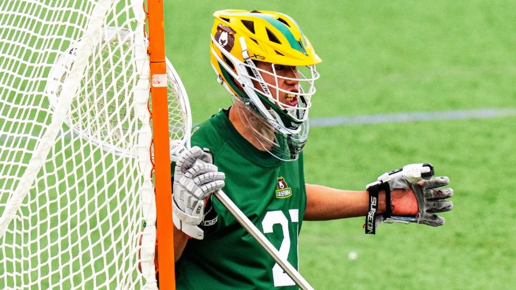
I have never seen a jersey like this before, and I’m obsessed with it. I don’t know how else to describe it other than it’s like a mix of a lacrosse, soccer and rugby jersey on the front.
As much as I love the Redwoods’ retro bear logo and thought for sure I’d want that incorporated in a bigger way than the shorts, having the state of California be the main imagery was the right choice.
The Redwoods are another team that usually has an easy layup with its uniforms given their color scheme, and I of course couldn’t be more thrilled to have all the color on this throwback jersey. The white helmet and shorts tie it all together and really give the jersey itself its time to shine.
2. Philadelphia Waterdogs
I mean, this is a dream. Bright purple jersey, bright purple helmet, timeless font across the front to celebrate a city that loves its sports teams, and bright white shorts with purple accents and the dog logo to contrast. 10,000/10, to be honest.
1. Boston Cannons
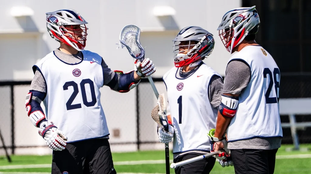
Before you say I’m biased, I’m a homer, be real with yourself — these are incredible.
When people think of THE sports city, nine times out of 10, their first thought is Boston. I love the subtle nod to the Bruins with the “B” logo on the front — it’s essentially the Spoked-B, without being spoked.
The navy stripes on the sleeves with the matching collar embodies the idea of “throwback.” Truly, when was the last time you saw a jersey like this in American sports?
And of course, the best part: the retro Cannons logo. I would buy every piece of merchandise available with that little bomb on it if I could. It’s the best of all eight teams’ retro logos and solidifies the Cannons’ spot at No. 1.
