Sarah Griffin’s Official Throwback Jersey Rankings
By Sarah Griffin | Aug 5, 2022
A long awaited day for PLL fans everywhere: Throwback jerseys.
In the spirit of important big J journalism, I’ve taken on the daunting task of rating each team’s throwback. While this is only one girl’s take and everyone is entitled to their own opinion, these are the correct rankings, obviously.
1. Archers LC
10/10, not a flaw in sight, perfection. When I think of lacrosse throwbacks, this is exactly what I have in mind. It’s giving Gary Gait at Syracuse and if we don’t get an Air Gait goal tribute from Will Manny or Marcus Holman in them this weekend, I’ll be thoroughly disappointed. As the kids say, these go hard.
Time to take this thing back. Way back.
— Archers Lacrosse Club (@PLLArchers) August 4, 2022
The @ChampionUSA Throwback Jerseys we're rocking this weekend in Denver ⏪ pic.twitter.com/2cFNeU0fbs
2. Waterdogs LC
I had Archers at #1 for two reasons: 1.) As I mentioned, it has that old school Syracuse essence to it, which any lacrosse fan can appreciate. 2.) The orange will always go. I love as much color as possible, which explains my rankings at two, three, and four.
Waterdogs take #2 for me simply because black and purple are a color combination I want to see more of in sports in general. The orange will always go, and purple will always go, not enough people realize this!
Also, if the Waterdogs can put up another ten or so highlight-reel worthy goals like they did last weekend only this time in these, that would be great.
3. Chrome LC
It was tough to pick between Chrome and Whipsnakes for spots three and four, and I would say these could be interchangeable, however I’m a sucker for pink so Chrome takes #3.
These are just straight up pretty and if I were to guess knowing the overall vibe of this Chrome team (gritty, probably don’t wear much bright pink and neon blue in their everyday lives), that’s probably not what they’re looking to hear, but it’s true. Pretty AND pink - can never go wrong. They’ve also got some Miami Heat feel to them and as much as I hate to admit it, I do love those jerseys as well. Overall, big fan.
Dusting off the old threads…
— Chrome Lacrosse Club (@PLLChrome) August 5, 2022
Introducing our @ChampionUSA throwback jerseys 🧊⚔️ pic.twitter.com/isfSwESBGI
4. Whipsnakes LC
These are equally as gorgeous as the Chrome jerseys and I’ve always loved the red and mint green color combination with the Whips jerseys. Aside from the lack of pink, the only thing with this one is I do wish it was red rather than white. If that were the case, it’d instantly be my #1 because I think the Whips’ color scheme is unmatched. Regardless, it's still a beauty.
Old School Snakes 🐍
— Whipsnakes Lacrosse Club (@PLLWhipsnakes) August 4, 2022
We’re going back in time this weekend in Denver with these @ChampionUSA Throwback Jerseys. pic.twitter.com/cljMRdbOAY
5. Chaos LC
The black and red combination always goes hard, and that’s no different here. I have zero grievances whatsoever with this jersey, I just like the four prior better. The Chaos roster is a bunch of cool guys with an overall cool team vibe, and this jersey matches that.
Unbias : This is Best one https://t.co/jUrXCv9Ddc
— Jerry Ragonese (@FlowGo37) August 4, 2022
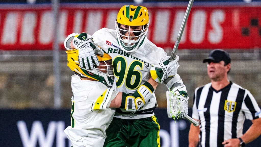
6. Redwoods LC
I know I said the more color the better, but I think my New England bias got the best of me here. Getting big Packers vibes from the Woods jersey, and as much as it pains me to say it, they look fantastic. Still #6 though.
Woods are rolling in a new (or should we say old 😉) style this weekend in Denver.
— Redwoods Lacrosse Club (@PLLRedwoods) August 4, 2022
Our @ChampionUSA throwback jerseys are 🔥 pic.twitter.com/XmmUtvye4q
7. Cannons LC
This Cannons jersey is clean and classic. If I put it any higher than #7 though, then I really would be letting my New England bias get the best of me. That being said, I whole-heartedly hope we get some Air Lyle in these, because somehow it’s going to make him even cooler, which I didn’t think was possible.
The #BoomSquad’s goin’ wayyy back 💣💥
— Cannons Lacrosse Club (@PLLCannons) August 4, 2022
Kicking it old school tomorrow on @espn with these @ChampionUSA jerseys. 👀 pic.twitter.com/IogwcNfR4F
8. Atlas LC
Absolutely nothing pained me more than having to put the Bulls last here. I don’t even dislike the jersey persay, I just had such high expectations with the powder blue and I’ll be honest, I was hoping for some purple in them.
Similar to the Cannons, this Atlas jersey is classic and clean. Powder blue always looks good, and that’s no different here. If anything, I wish it could’ve been powder blue instead of white. Again I don’t dislike it, I just expected more.
The Bulls are taking it back to the good ole days. 😎
— Atlas Lacrosse Club (@PLLAtlas) August 4, 2022
We’ll be rocking these @ChampionUSA throwback jerseys this weekend in Denver. 🥶 pic.twitter.com/ls3pfFG9rk