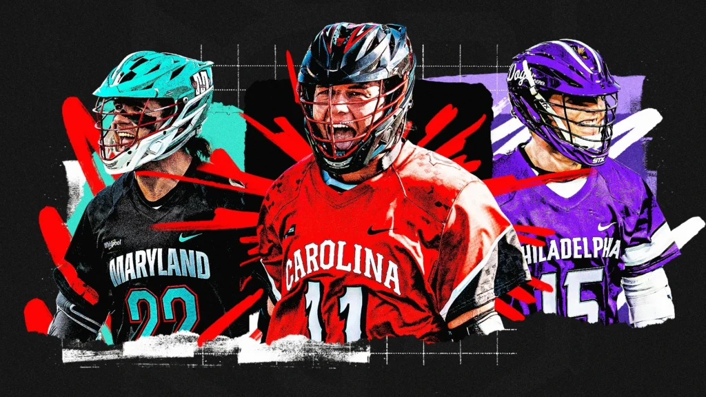
Sarah Griffin’s Championship Series Jersey Rankings
By Sarah Griffin
Feb 21, 2023
In my third rendition of PLL jersey rankings, this one was without a doubt the hardest. The Championship Series jerseys are all hits, no misses to sum it up best. Here’s my ranking of each team’s Championship Series threads.

1. Chrome LC
I’ve sounded a bit like a broken record in the past when it comes to emphasis on color in jerseys, and always felt like the Chrome were just right there when it comes to the execution of their neon blue and pink. These jerseys not only push them over that threshold; they absolutely knock it out of the park.
Chrome’s color scheme was made for the Championship Series. The electricity of the blue and pink perfectly encapsulate the speed and tempo of the Olympic format. Contrast those with the black base and the chainmail look to top it off along with those metallic helmets? Chrome LC’s armor has never looked better.

2. Archers LC
The Archers put the perfect twist on their traditional uniforms in the name of re-designing and enhancing their classic look for a quicker tempo of the game. There’s a newfound vibrancy to the signature orange and blue. With their helmets to match, it’s going to look incredible on the field in motion.
I’m also a big fan of the chevron patterning on the side panels. I think these do just enough to give the fastest offense in lacrosse that extra detail needed to symbolize their speed.

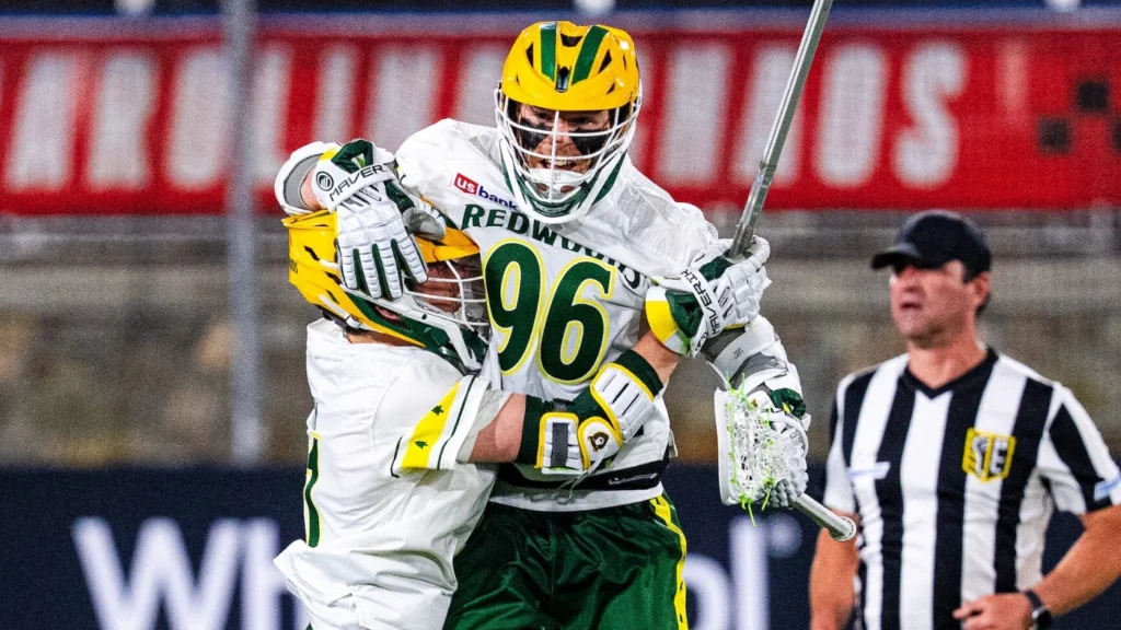
3. Atlas LC
With Atlas’s solar blue, it’d be quite difficult to make anything besides a near-perfect product for this style of the game. I love that they stuck with the solar blue as the base for the uniform; my only knock is I wish there were some more pronounced changes to accentuate the upgrade from their traditional threads to these ones.
I do appreciate the slight change in the color scheme with the purple rather than navy or only the solar blue and white. The purple have their own new topographic detailing in them to coincide with Atlas’s name. My only wish is that the detailing was as obvious as with the other three teams.

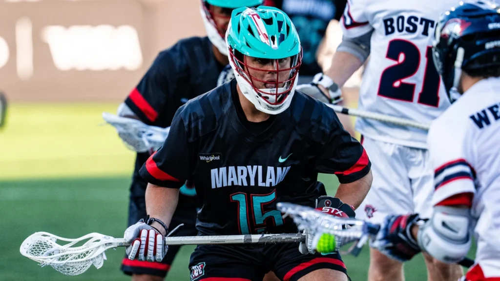
4. Whipsnakes LC
The Whipsnakes got back to their winning roots with their Championship Series uniforms, and I mean that literally. The Whips haven’t worn white jerseys since 2019 and 2020, coincidentally both years they took the championship title. As the number one seed in the 2022 season and with expectations high for them in this tournament, I love that they’re utilizing white again.
I also love the detailing on these jerseys as well. The teal and red combo is so unique and has become synonymous with success in the PLL. Tying the whole thing together with the scales on the helmet and the snake-inspired patterning on the sleeves, they nailed this one.