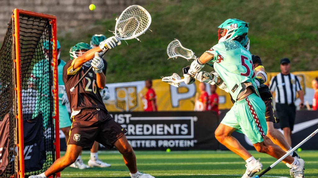
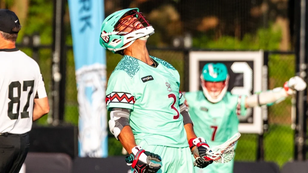
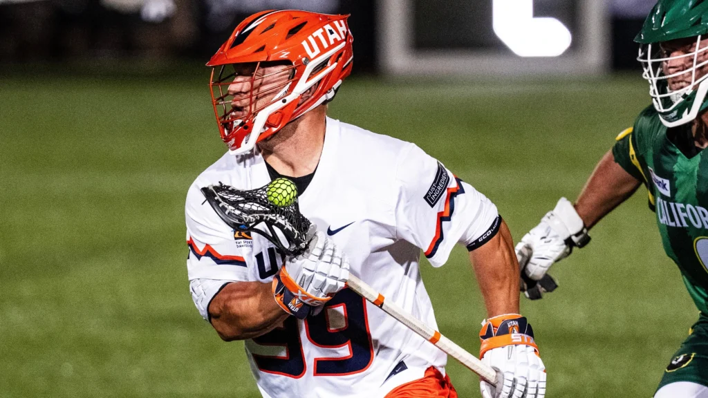
Sarah Griffin’s 2023 Season Jersey Rankings
By Sarah Griffin
Jun 1, 2023
For the first time since the league’s inception in 2019, all 8 PLL teams got a makeover with re-designed jerseys. This certainly isn’t my first rodeo ranking jerseys, so I’d like to consider myself a (self-proclaimed) pro at this point. That being said, here are my rankings of all 8 teams new uniforms.
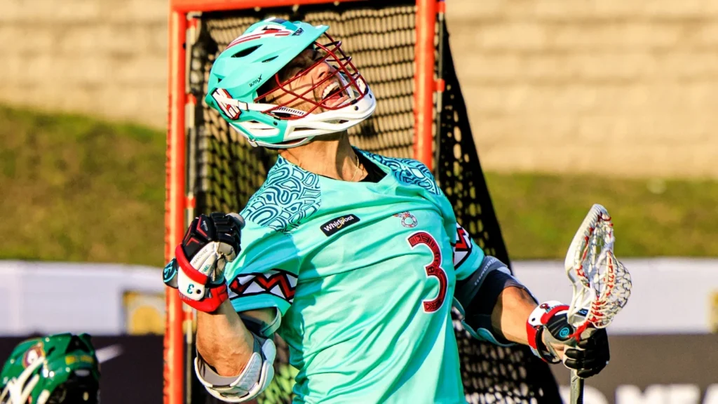
1. Atlas LC
I’ll admit, it’s hard to mess up a good thing when you have the Atlas’ color scheme. The powder blue will just always do it for me.
While there aren’t any huge cosmetic changes, the little ones make all the difference. I love the addition of the horns on the sleeve. My only gripe with these ones, while minor, is I do wish they included the purple accents more. Other than that, the Bulls’ uniforms remain cream of the crop to me.
2. Cannons LC
Perhaps it’s the Boston homer in me (it is), but the homage to the Boston Cannons in these new jerseys is exactly what Cannons LC needed.
The Boom Squad has the most significantly different looking uniforms from last season to now and it’s only fitting given all the new faces. They’ve taken the classic look from the club’s MLL days and refined it. Again, I’m definitely a Boston homer but the Boston Cannons had my favorite MLL jersey, so it’s possible once I see these on the field in action they bump up to number one.
3. Chaos LC
Similar to Atlas, Chaos didn’t have any huge changes to the jerseys themselves aside from a cleaner version of their signature “chaotic” pattern, but that’s because they didn’t need to. The biggest change to the Chaos uniform actually came with the helmets. They added a black colorway along with a scorpion decal on the back panel and their buckets are looking *chef’s kiss*. When you put the whole look together, it screams swagger which is what Andy Towers’ club is all about.
4. Waterdogs LC
The champs certainly received the winning treatment with their re-designs. Not only did they add a highly-requested white jersey to their rotation, but they also now have a patch of the PLL Championship Trophy on all their uniforms. Just in case anyone forgot, they’re still champs.
Atlas may have my favorite color scheme, but the Dogs aren’t far behind. The purple and white in particular look extremely clean. If anything, I’d like them to incorporate the light purple color in their palette more, but that’s just my personal preference.
5. Redwoods LC
The Woods have the most iconic uniform in the league so I’m glad they made only minor changes. The yellow trim is a subtle but great touch. Also a big fan of the trees on the back of helmet. Overall, the Redwoods uniform remains iconic as ever.
6. Archers LC
Another team who added a new white jersey to their rotation, I like the Archers uniforms, but I don’t love them. They have fun colors and the white jerseys are really going to make the orange pop, but I’m not fully sold.
That being said, similar to the Cannons they’re a team that could completely change my mind the second they take the field. Something about seeing jerseys in action can really change things. I’m holding out hope.
7. Chrome LC
I’ve said it once and I’ll say it again: I will not rest until we get pink jerseys. I love the use of the electric blue as the side stripes and I love even more that the inspiration came from the armor of actual knights, but I remain loyal to my cause.
Heck, I’ll even take more pink accents. Either way, more pink is the cheat code for Chrome to bump to number one on my list.
8. Whipsnakes LC
Admittedly, maybe I just have a problem with change but the new Whips uniforms will definitely take some getting used to for me solely because I loved the old ones so much. I do love the move to bring back white jerseys for the Whips. They're a team known for a winning culture - it's a no-brainer to bring back the color you won both your championships in. A real vet move.